Own your components. Update them anyway.
Accessible Angular components you install as source. Signals‑first, with a CLI that merges upstream fixes into the code you changed. Built for you and your agent.
- WAI-ARIA
- SSR
- Zoneless
- Signals
Component showcase
Create your account
Join the Sawa Studio workspace.
At least 12 characters.
Payment method
Billed monthly for the Pro plan.
Uploads
Two files to Brand assets.
- brand-guidelines.pdf100%
- logo-pack.zip64%
This week
All pages
12,480
+18.2%Compared with last week
Use the arrow keys to read each day.
| Day | Visitors |
|---|---|
| Monday | 1420 |
| Tuesday | 1980 |
| Wednesday | 1710 |
| Thursday | 2140 |
| Friday | 2480 |
| Saturday | 1260 |
| Sunday | 1490 |
1,284
+9.4%Compared with last week
Use the arrow keys to read each day.
| Day | Sign-ups |
|---|---|
| Monday | 164 |
| Tuesday | 212 |
| Wednesday | 178 |
| Thursday | 236 |
| Friday | 248 |
| Saturday | 102 |
| Sunday | 144 |
Team members
Four people in Product.
- ANOwner
Amara Nwosu
amara@sawa.studio
- KMAdmin
Kwame Mensah
kwame@sawa.studio
- SRMember
Sofia Rossi
sofia@sawa.studio
- YTMember
Yuki Tanaka
yuki@sawa.studio
Labels
On the Kribi Foods rebrand.
Board defaults
For new projects in Product.
Team offsite
Kribi, with the whole studio.
| Sun | Mon | Tue | Wed | Thu | Fri | Sat |
|---|---|---|---|---|---|---|
Notifications
Choose what reaches your inbox.
When someone mentions you in a comment.
A summary of your projects every Monday.
New features, about once a month.
Billing questions
Invoices
October 2026
| Select | Client | Status |
|---|---|---|
| Kribi Foods €4,200 | Paid | |
| Lagos Ledger €2,750 | Pending | |
| Nairobi Rides €1,980 | Overdue | |
| Tanaka & Rossi €3,100 | Paid |
Plan usage
Pro plan, renews 1 November.
Verify your email
Enter the code we sent to fatou@sawa.studio.
Updates
Edit it. Update it anyway.
Change any file you install. ndop update merges upstream's fixes into your version, the way git merge does.
npx @ndop/cli update button Conflicts get markers and a non-zero exit, never a silent overwrite.
How updates workconst buttonVariants = variants({
base: 'inline-flex items-center justify-center gap-2 rounded-md text-sm font-medium transition-colors focus-visible:outline-none focus-visible:ring-2 focus-visible:ring-ring disabled:pointer-events-none disabled:opacity-50',
variants: {
variant: {
default: 'bg-primary text-primary-foreground hover:bg-primary/90',
outline: 'border border-input bg-background hover:bg-accent',
ghost: 'hover:bg-accent hover:text-accent-foreground',
destructive:
'bg-destructive text-destructive-foreground hover:bg-destructive/90',
},
size: {
sm: 'h-8 px-3',
md: 'h-9 px-4',
lg: 'h-10 px-6',
icon: 'size-9',
xl: 'h-12 px-8 text-base',
},
},
defaults: { variant: 'default', size: 'md' },
});const buttonVariants = variants({
base: 'inline-flex items-center justify-center gap-2 rounded-md text-sm font-medium transition-colors focus-visible:outline-none focus-visible:ring-2 focus-visible:ring-ring disabled:pointer-events-none disabled:opacity-50',
base: 'inline-flex items-center justify-center gap-2 rounded-md text-sm font-medium transition-colors focus-visible:outline-none focus-visible:ring-[3px] focus-visible:ring-ring/50 disabled:pointer-events-none disabled:opacity-50',
variants: {
variant: {
default: 'bg-primary text-primary-foreground hover:bg-primary/90',
outline: 'border border-input bg-background hover:bg-accent',
ghost: 'hover:bg-accent hover:text-accent-foreground',
destructive:
'bg-destructive text-destructive-foreground hover:bg-destructive/90',
link: 'text-primary underline-offset-4 hover:underline',
},
size: {
xs: 'h-7 px-2 text-xs',
sm: 'h-8 px-3',
md: 'h-9 px-4',
lg: 'h-10 px-6',
icon: 'size-9',
},
},
defaults: { variant: 'default', size: 'md' },
});const buttonVariants = variants({
base: 'inline-flex items-center justify-center gap-2 rounded-md text-sm font-medium transition-colors focus-visible:outline-none focus-visible:ring-[3px] focus-visible:ring-ring/50 disabled:pointer-events-none disabled:opacity-50',
variants: {
variant: {
default: 'bg-primary text-primary-foreground hover:bg-primary/90',
outline: 'border border-input bg-background hover:bg-accent',
ghost: 'hover:bg-accent hover:text-accent-foreground',
destructive:
'bg-destructive text-destructive-foreground hover:bg-destructive/90',
link: 'text-primary underline-offset-4 hover:underline',
},
size: {
xs: 'h-7 px-2 text-xs',
sm: 'h-8 px-3',
md: 'h-9 px-4',
lg: 'h-10 px-6',
icon: 'size-9',
xl: 'h-12 px-8 text-base',
},
},
defaults: { variant: 'default', size: 'md' },
});
Agents
Built for agents.
Your coding agent reads the real API, installs what it needs and checks its own work, instead of guessing.
MCP server
Every component, example, block and token for your agent, which can also install items and run verify.
npx -y @ndop/mcpDocs agents can read
An index of every page, and each page as Markdown at its URL plus .md.
/llms.txtGuidance in your project
ndop init writes the installed components, tokens, where files go and the workflow into AGENTS.md.
AGENTS.mdndop verify
Checks usage, build, lint and accessibility, and names the file, line, rule and fix.
npx @ndop/cli verify src/app
An eval suite of 89 prompts runs an agent with only the MCP server and scores each result with ndop verify.
Set up your agent- You: Add a notifications page with email and push switches.
- Tool call: get_project_context, returned Angular 22, zoneless; button, card, input installed
- Tool call: search_components "toggle setting", returned switch, toggle, checkbox
- Tool call: get_component switch, returned usage, parts, inputs, keyboard map
- Tool call: add_items ["switch", "form-field"], returned installed
- Writes src/app/notifications/notifications.ts
- Tool call: verify src/app/notifications, returned 1 problem
- Problem: notifications.ts:18 ndop/form-control-label: Nothing labels this control. Add an ndLabel with for set to its id, wrap it in a label, or give it aria-label.
- Adds a label to the push switch
- Tool call: verify src/app/notifications, returned passed
Accessibility
Accessible by contract.
Each primitive implements a written keyboard and ARIA contract. Here is Tabs', live: turn on Try the keyboard and press keys on the tabs.
Overview
The Kribi Foods rebrand: twelve screens, due Friday.
Activity
Amara approved the new logo two hours ago.
Settings
Visible to Product. Weekly digest on Mondays.
Focus a tab, then use the arrow keys, Home and End.
Keys the component handles.
| Key | Action |
|---|---|
| Tab | Moves focus into the tab list, to the selected tab; then to the active panel. |
| ArrowRightorArrowLeft | In a horizontal list, moves focus to the next or previous enabled tab, wrapping; selects it if automatic. |
| ArrowDownorArrowUp | In a vertical list, moves focus to the next or previous enabled tab, wrapping; selects it if automatic. |
| Home | Moves focus to the first enabled tab; selects it if automatic. |
| End | Moves focus to the last enabled tab; selects it if automatic. |
| EnterorSpace | Selects the focused tab. |
WAI-ARIA patterns
Primitives follow the Authoring Practices, with the roles, states and keys each pattern names.
axe on every route
CI runs axe on every page of these docs, in every browser, and fails on any violation.
A spec.md per primitive
Its keyboard map and focus rules are written down, and the tests and this table come from it.
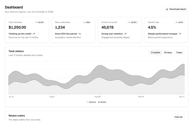
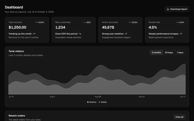
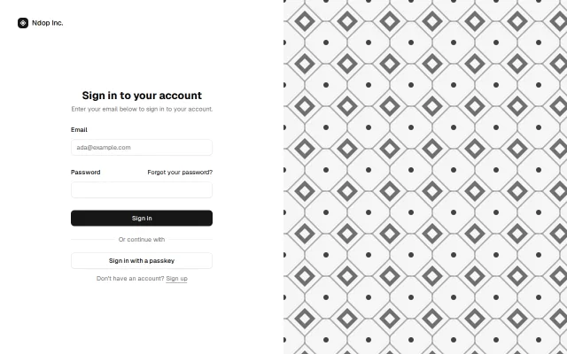
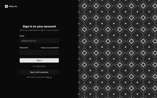
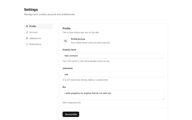
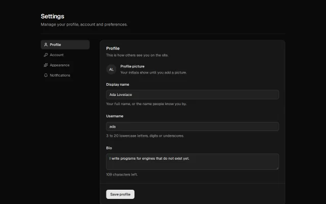
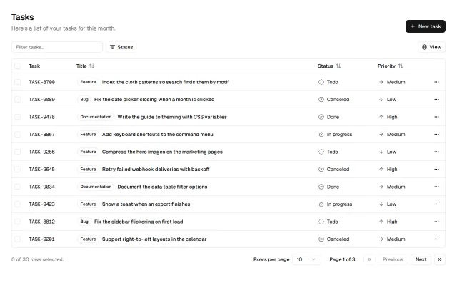
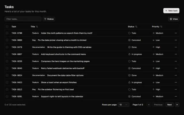
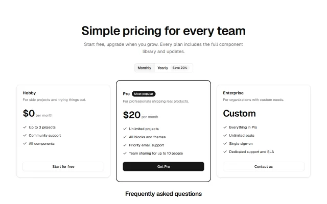
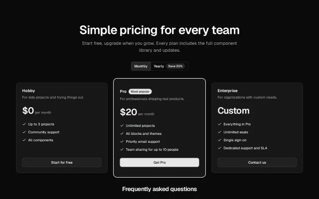
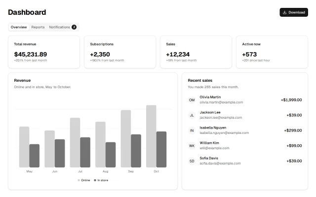
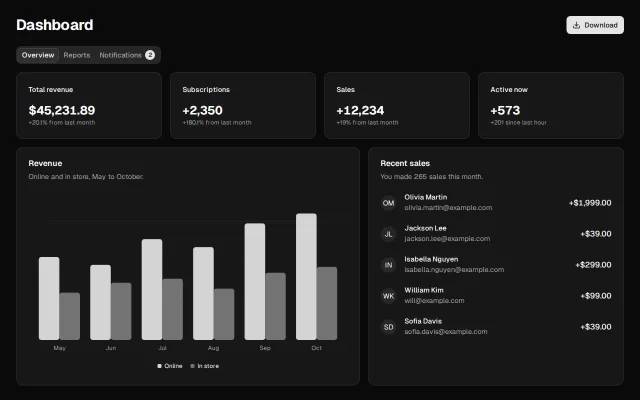
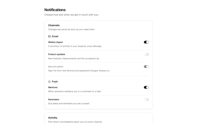
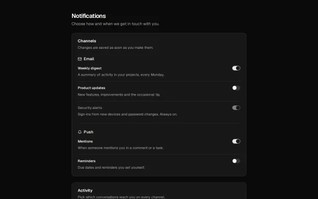
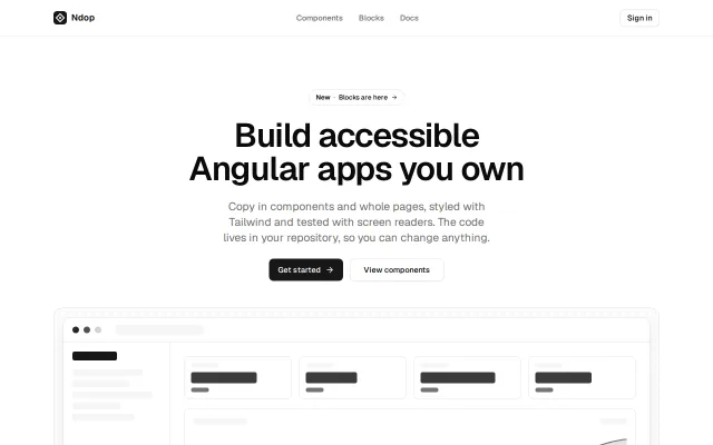
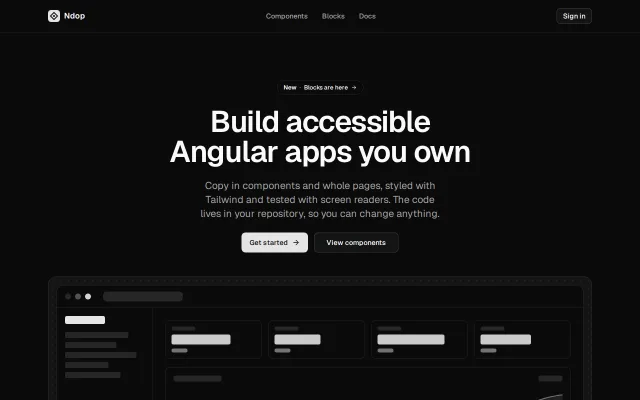
Blocks
Start from a whole screen.
Logins, dashboards, settings and more, made of the same components. Add one with a single command, then make it yours.
By the numbers
Read from this build.
Counted from the registry and measured by the size report this site was built from.
- Components
- 50
- Blocks
- 12
- Themes
- 5
- Button, gzipped
- 1.3 KB
- axe violations in CI
- 0
- Angular versions
- 21 & 22
Add your first component.
Set Ndop up in an Angular app, then add what you need. Every file is yours from the start.
npx @ndop/cli init